
“As the person whose name is on the patent application, you are ultimately responsible for the content and form of the drawings that are submitted.”
While it has been said that the how and why of patent application drawings are usually best left to the professionals, I do think it is important for everyone – from the solo inventor to the big firm practitioner – to have a general understanding of the basics of utility application drawings. It is nice to be able to rely on an illustration service to get everything right for you; however, as the person with the name on the patent application, you are ultimately responsible for the content and form of the drawings that are submitted.
This article will touch on the fundamentals of a utility drawing. While you may not be creating the drawings, it is crucial that you have an idea of what to look for in order to be compliant with U.S. Patent and Trademark Office (USPTO) guidelines.
Lines, Numbers and Figures
The standard for drawings submitted in a patent application is that they will be black and white line drawings, with a solid and secure black line. There is more leniency in what you decide to file with a provisional patent application, but most non-provisional patent applications will require you have black and white line drawings.
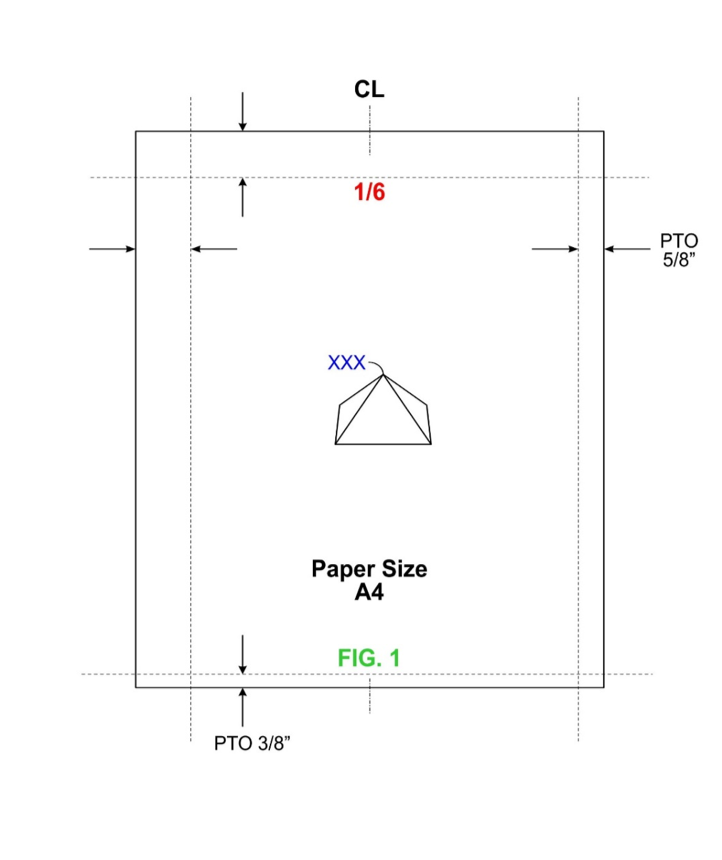
Each sheet and figure must be numbered consecutively, and all text must be at least 1/8 inch in height for legibility upon reduction. You will find a figure below (Sample A) that gives an example page layout with some of the fonts and sizes used by most drafting firms. The two most traditionally used paper sizes are A4 and Letter; most drafting companies will use a default unless specifically instructed to use a certain size.
Sample A below shows several key features that inventors and practitioners should be aware of on their utility application drawings. I’ll first draw your attention to the red colored number—this is the sheet number and must be in consecutive order for all figure sheets you intend on filing. The sheet numbers are aligned on the centerline of the page and do not move as a result of changes in the drawing field.
SAMPLE A
Next are the blue XXX’s in the middle of the page—these are referred to as reference numbers or numbers used to call out certain features in your written description. These numbers are usually the minimum text height of 1/8 of an inch. This is important to note, as the USPTO will reduce the drawings and in order to be sure your reference numbers are legible they need to be the proper height.
The last colored feature I will note on Sample A are the green figure numbers at the bottom of the page. Similar to the sheet numbers, these will proceed in a consecutive order as you add more figures, e.g., FIG. 1, FIG. 2, FIG. 3, etc. Unlike the sheet numbers the figure numbers can float around inside of the drawing surface. This is especially true if the figure needs to be oriented in a landscape format. This would result in the figure number being rotated and placed somewhere near the bottom of the figure.
The final features to note on Sample A above are the margins. These are the minimum margin requirements as put out by the USPTO. Most drafting services will have margins smaller than these to ensure your figures are well within the drawing surface and there is no chance of losing a piece of a figure when it is reduced.
Lead Lines
SAMPLE B
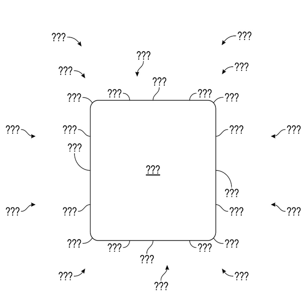
We noted previously that reference numbers are used to correlate a feature to a written description of that feature. In order for an examiner to understand exactly which feature of a drawing you are trying to delineate you will need to include a lead line or other indica that links your reference number to that feature.
Sample B to the right illustrates how lead lines are organized based on the quadrants of an XY coordinate plane. The rule of thumb concerning lead lines is that they meet the object, line, or surface they are identifying at a right angle. As is apparent in Sample B the lead lines are rotating and or being mirrored based on the quadrant that the feature being labeled is in. The length and orientation of these lines can change based on the situation as well, the main point of emphasis is the meeting point between the line and the object.
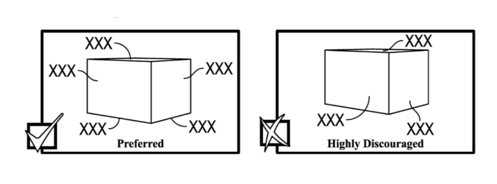
Sample C below illustrates this idea in a more three-dimensional manner. We see an example of a preferred arrangement of lead lines on an object vs. a highly discouraged example. One thing to note is that while the highly discouraged example is not wrong, it could lead to confusion with respect to the examiner understanding which portion of a figure you are describing. As mentioned before the preferred method has the lead lines meeting the object, surface or edge at a 90-degree angle.
SAMPLE C
Aesthetics and Improving Readability

SAMPLE D
Once we understand that each lead line should meet the object at a right angle, we can begin the conversation on symmetry. It is important to make your drawings as easy to understand as possible. While this predominately relates to the content of the figure, there is an element of the aesthetic that must be taken into consideration. If something is not easy to look at or distracting it then becomes more difficult to interpret the point or purpose behind a drawing.
Sample D to the right shows two very rudimentary utility figures with reference number place holders and lead lines included. The “before” image is correct with regard to what we have discussed to this point— the lead lines are meeting their objects or lines at 90-degree angles and each item in the cycle has been identified. However, there are a few small changes that can be made to assist the viewer’s flow and understanding of the drawing.
Let’s examine the “after” figure. It’s the same layout as the previous figure with a few small details changed. One thing to point out before we discuss those changes is that, when organizing a figure, it helps to imagine the XY coordinate plane superimposed over it. This gives a visual representation to the balance of the drawing. The “after” figure has been amended to illustrate this purpose. The first change to notice is that the “Network” cloud has been centered, this establishes the center line of the drawing as well as balancing the top of quadrants 1 and 2.
The next change made is the adjustment of the lead lines and reference numbers in quadrant 1. The “before” figure has them located inside of the illustrated cycle, leaving a large white space in that upper left segment of the figure. With such a dominant element (the computer) in quadrant 4 it is important to balance the image on the page, moving the reference numbers to the outside of the cycle achieves this.
Flow Charts
SAMPLE E
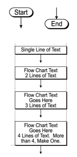
The last topic I will address is a brief look at flow charts and the general principles for these figures. While constituted of relatively simple parts it is still important to consider symmetry and balance when making flow chart drawings. Sample E to the left has a few items for consideration, the first being the pill shaped objects with the words “Start” and “End” in them. Most drafting services will have a default for the beginning and end of a flow chart unless otherwise instructed by the client. Not all flow charts need a start and end bubble and it is important to check and see if any parties involved have specific guidelines regarding these.
Written content for each flow chart will vary based on the subject matter for each application; however, the boxes and arrows that make up the flow chart should follow a consistent organizational theme. Sample E illustrates the two most fundamental ideas to making a clean, well-organized and aesthetically pleasing flow chart. The first idea being that all the boxes in a flow chart should be the same width—the height of the box will be dictated by how many lines of text are present, but the width will be consistent between each box.
The second fundamental idea surrounding flow charts is that all the arrows between boxes should be the same length. When multiple arrow lengths are introduced, the spacing between each box is inconsistent. In a flow chart figure the difference in spacing between blocks is very evident and can draw or distract the viewer/examiner from the content of the chart. As long as the box width and the arrow length remain consistent in a constructed flow chart the result should be a relatively well balanced and easy to view drawing. There are, of course, numerous iterations of the box style or arrow style, drop shadow size, text font, etc. that can be changed; this is simply to point out the balance and order created from some content organization techniques.
When to Get Help
There will undoubtedly be numerous situations that don’t quite fall under the umbrella of the above discussion. If that is the case, it is recommended that an illustration firm get involved, if for nothing else than a consult on a drawing. The next article will discuss methods to improve the efficiency of those communications so, if you do need to use a drafting service, it will be a smooth and easy process.
![[Advertisement]](https://ipwatchdog.com/wp-content/uploads/2024/04/Patent-Litigation-Masters-2024-sidebar-early-bird-ends-Apr-21-last-chance-700x500-1.jpg)

![[Advertisement]](https://ipwatchdog.com/wp-content/uploads/2021/12/WEBINAR-336-x-280-px.png)
![[Advertisement]](https://ipwatchdog.com/wp-content/uploads/2021/12/2021-Patent-Practice-on-Demand-recorded-Feb-2021-336-x-280.jpg)
![[Advertisement]](https://ipwatchdog.com/wp-content/uploads/2021/12/Ad-4-The-Invent-Patent-System™.png)


Join the Discussion
2 comments so far.
ChrisWhewell
March 16, 2021 10:31 amAhhh, brings back memories, from when we had to go to the stationery store and buy special “patent office board”, and we had to hand-draw everything, using India Ink !! People today have it easy…. 🙂
Autrige Dennis
December 31, 2020 01:04 amGreat article every bit of it. As a Patent Illustrator at ASCADEX Patent Illustrating Services, http://www.ascadex.com I find the part about Lead Lines very informative. I often find myself suggesting drawing views to inventors clients who tells me they plan to prepare their own provisional application instead of using the services of a patent attorney. After I complete the their drawings I often realize they don’t know much about how to label their drawings. This article will be very helpful for me and I will always refer inventors to this article. I can’t wait to see the next one.